A LinkedIn carousel is a PDF uploaded as a document post, shown one page at a time in the feed. For code, use 4:5 slides (1080 × 1350 px), one idea and one code block per slide, and code at 31 px or more so it stays readable on a phone.
Below are the rules we follow, each one shown on a carousel we made about TypeScript 7.
What is a LinkedIn carousel in 2026?
Two different things carry the name, and many “carousel” guides mix them up.
The document post is what people mean when they say carousel. You upload a PDF (or PPT, PPTX, DOC, DOCX) and LinkedIn shows it as swipeable pages. The limits, from LinkedIn’s help page, are 100 MB and 300 pages. Anyone who can see the post can download the file as a PDF.
The carousel ad is a paid Sponsored Content format. Its specs ask for 2 to 10 cards, recommend 1080 × 1080 px images, and cap each card at 10 MB. None of that applies to a document post. If a guide tells you a carousel can have 10 slides at most, it’s quoting the ad specs.
What size should a LinkedIn carousel be?
LinkedIn’s help page for documents sets file limits, not a page size, so the choice is yours. These are the three shapes Carouselr offers:
| Shape | Size in px | On a phone |
|---|---|---|
| 4:5 portrait | 1080 × 1350 | Tallest of the three |
| 1:1 square | 1080 × 1080 | 20% shorter than 4:5 |
| 16:9 landscape | 1280 × 720 | A thin strip |
At the same width, a 4:5 slide is 25% taller than a square one (1350 / 1080 = 1.25). On a phone held upright that means more room for code and a bigger picture on screen. That’s geometry, not a promise about reach. We use 4:5 for everything with code in it.
Seven rules for code slides
1. The first slide sells the swipe
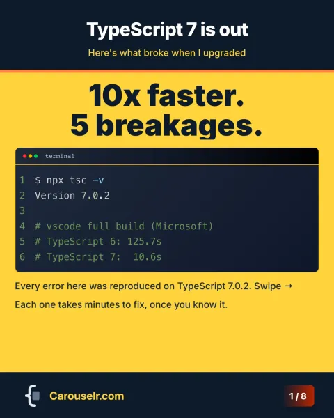
The cover has one job: make someone swipe. Ours for TypeScript 7 says “10x faster. 5 breakages.” in the biggest type on the slide, with six lines of terminal output underneath as proof: the version number and Microsoft’s own build times for the VS Code repo. The promise is short, and the code backs it up.
2. One idea and one code block per slide
Each breakage gets its own slide: a title that names the symptom (“Your path aliases stop compiling.”), one sentence of context, the code, and two short notes. Two snippets on one slide means two code blocks at half the height each, and at a readable size there is no room for that.
3. Six lines of code at 31 px
In how to post code on LinkedIn we worked out that code needs about 31 px on a 1080 px slide to reach Apple’s 11 pt minimum on a phone. At that size a 4:5 slide with a title and a sentence holds about six lines, none much longer than 46 characters. Our TypeScript slides stay within that: the longest line is $ npx tsc --declaration --emitDeclarationOnly, at 45 characters.
A long command or error message is the usual problem. Break it where you’d break it in a terminal, or keep the part people need to recognise. The tsup error on slide 7 keeps the TypeError and the property name, which is what someone searching their own logs will match.
4. Highlight the line that matters
On a fix slide, the reader should find the fix without reading the error. Highlight that one line. On the baseUrl slide it’s line 6, the corrected paths entry. On the package.json slide it’s the two version strings. More than two or three highlighted lines and nothing stands out.
5. Name the file
A file name in the bar above the code does the work of a sentence. tsconfig.json, package.json and terminal tell the reader where the code lives before they read a line of it, and the slide text stays short.
6. Make the text as readable as the code
The 31 px rule applies to every word on the slide. Our first version used bullet lists at 24 px, about 8.7 pt on a phone. We turned each list into two short notes at 30 px and dropped the third point. Keep contrast high as well: dark code panels on a light slide, and a highlight you can see. In Carouselr a highlighted line gets a tint plus a coloured bar at the edge of the panel, in a colour picked to stand out against it.
7. End with a cheat sheet and your sources
The last slide is the one people save. Ours lists each error code next to its fix, then the sources and the version everything was tested on: “Every error reproduced on TypeScript 7.0.2.” Developers check claims. Tell them where yours come from.
A worked example: TypeScript 7, slide by slide
Here is the whole carousel. Every error on it was reproduced on TypeScript 7.0.2 before we made the slides.
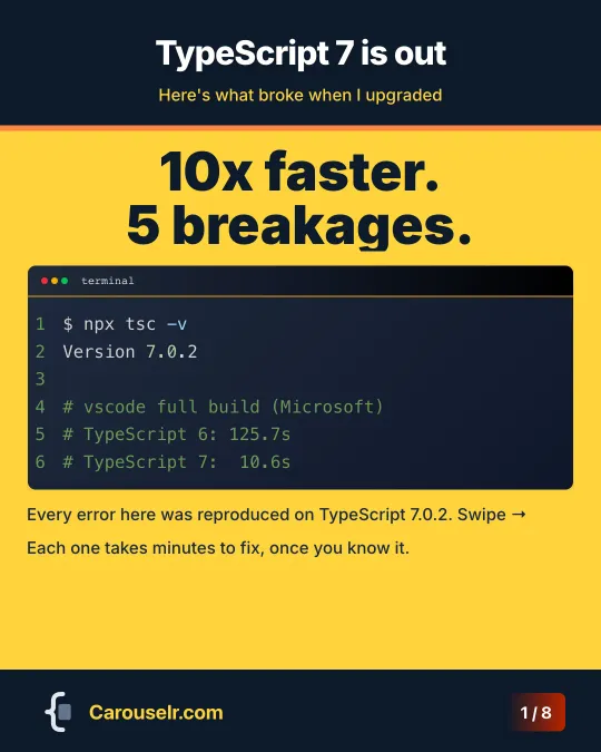
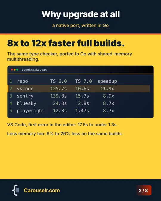

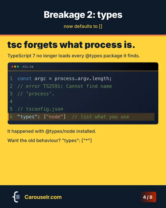
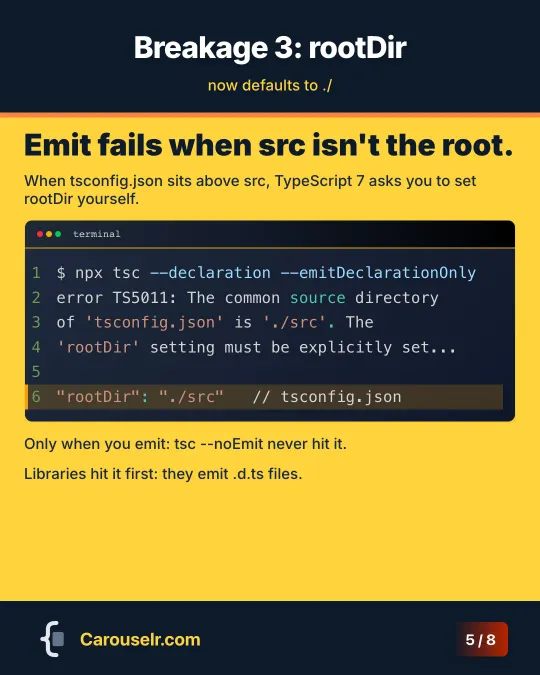
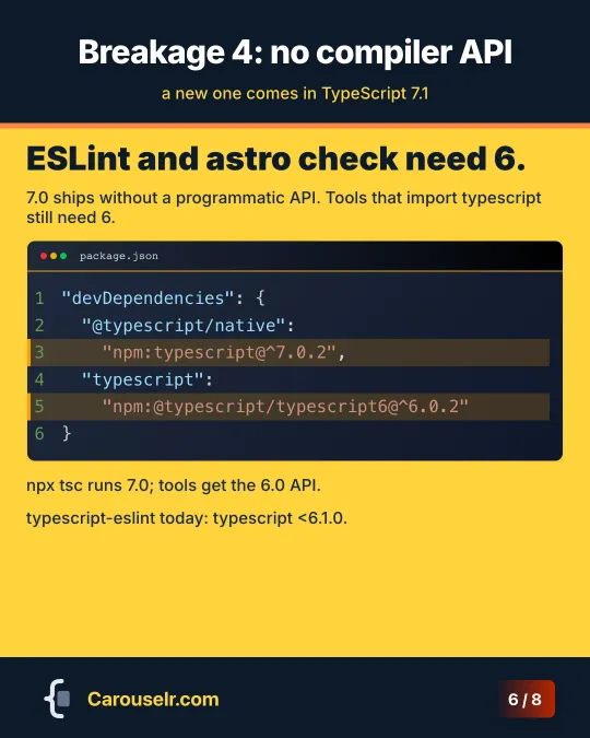

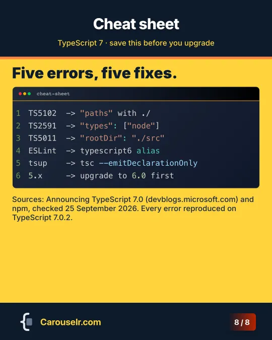
- Cover. The claim and the proof, in one screen.
- Why upgrade. A benchmark table from Microsoft’s announcement. Numbers line up because the font is monospaced, which is one more reason tables of results belong in a code block.
- baseUrl. The error, the old config, the fix. Three things, six lines.
- types. The surprise here is that
@types/nodewas installed, so the slide says so in a note. - rootDir. Only hits you when you emit. The note says that too, so people who run
tsc --noEmitcan skip it. - No compiler API. People paste this block as it is, so it keeps the exact version ranges.
- tsup. The build doesn’t fail where you expect: the bundle works, the types step crashes.
- Cheat sheet. Five errors, five fixes, one line each, plus one line for anyone still on TypeScript 5.
How many slides should a LinkedIn carousel have?
We haven’t found a study we trust that gives a best number, so we won’t invent one. LinkedIn allows up to 300 pages; your readers will stop long before that. Our carousels have 8 slides: a cover, six content slides and a cheat sheet. It’s a structure that fits five items plus one extra, not a rule.
If you make them in Carouselr, the free plan allows 8 slides per carousel and Pro allows 20.
Not sure what to post about in the first place? We use the release calendar of the tools we already work with, explained in personal branding for developers.